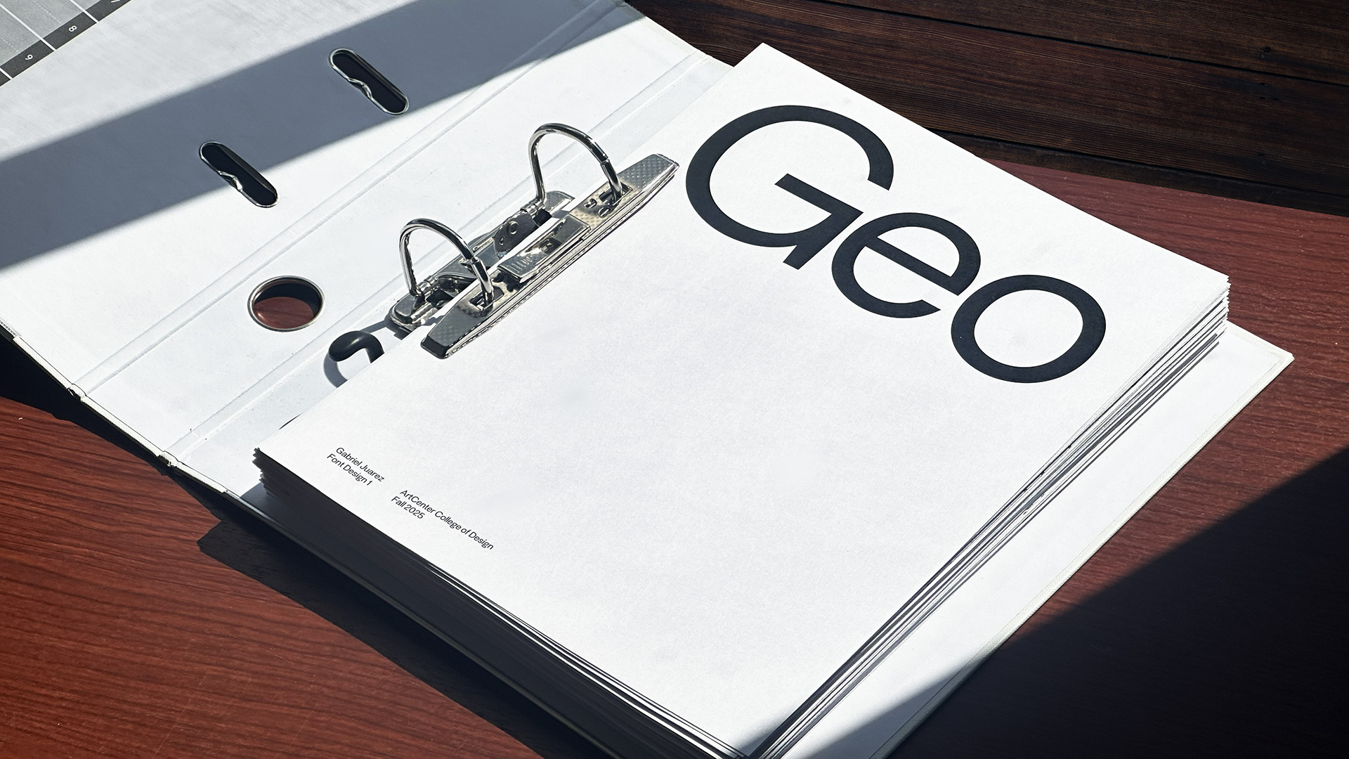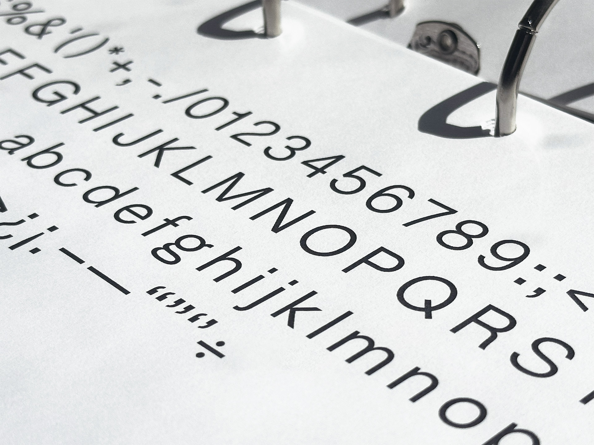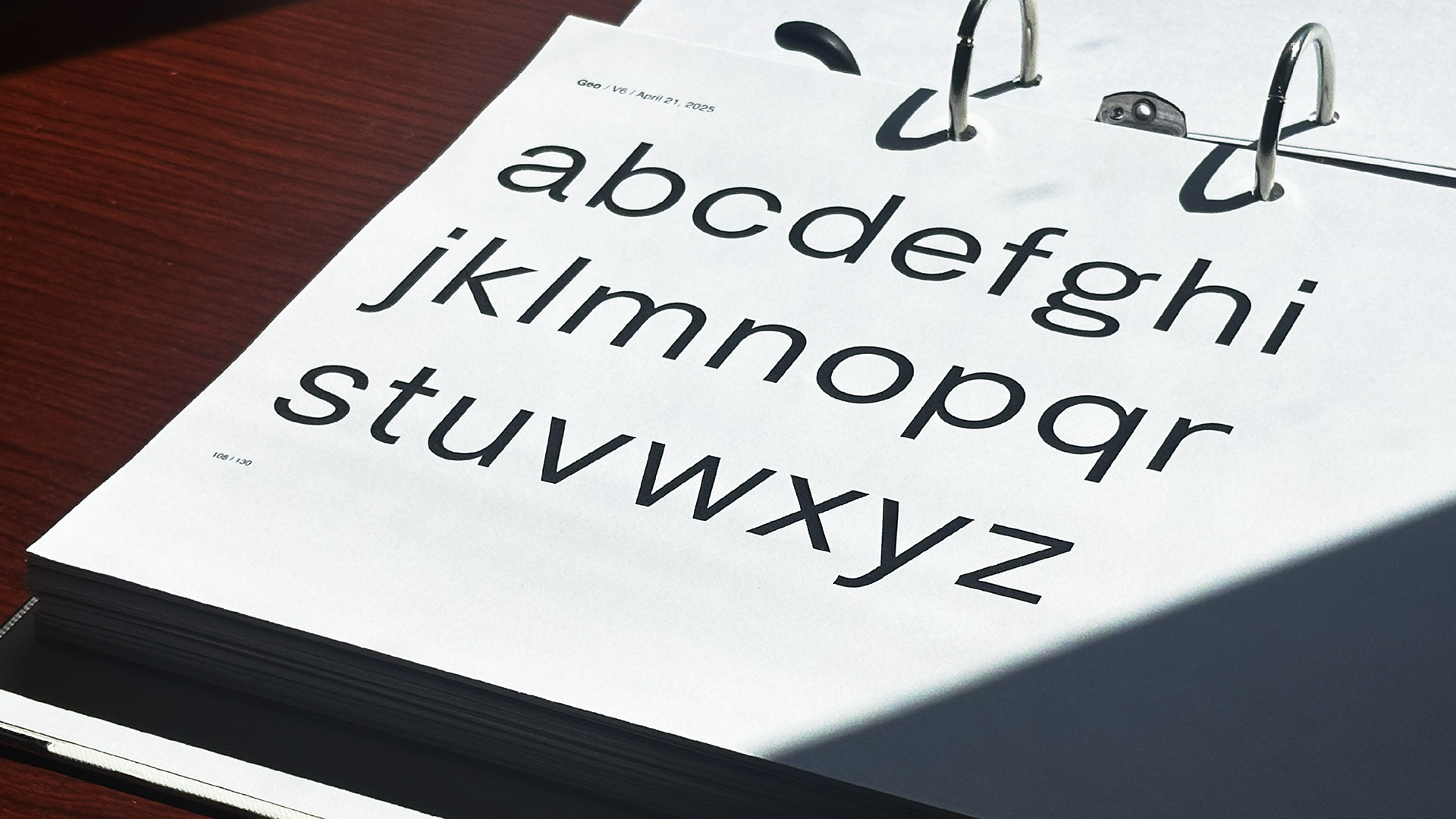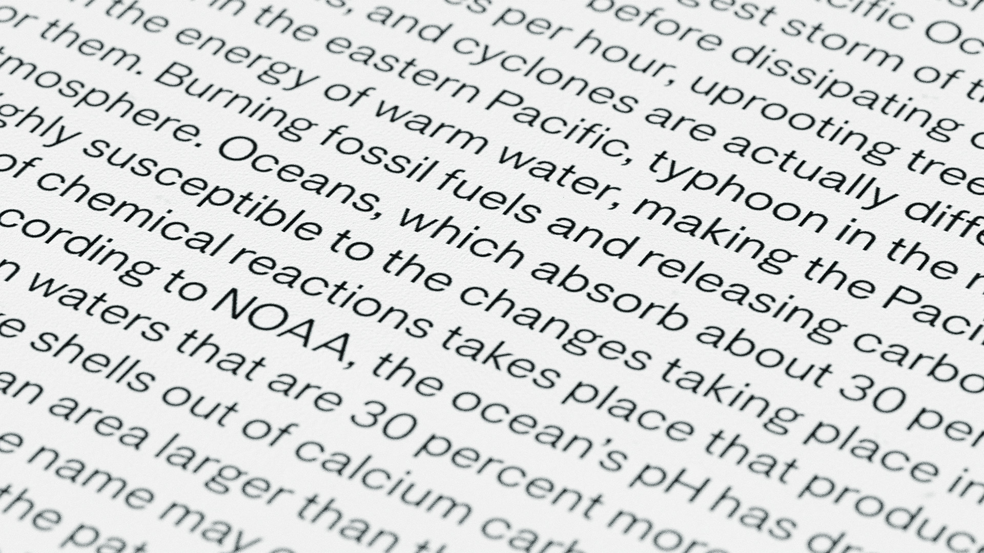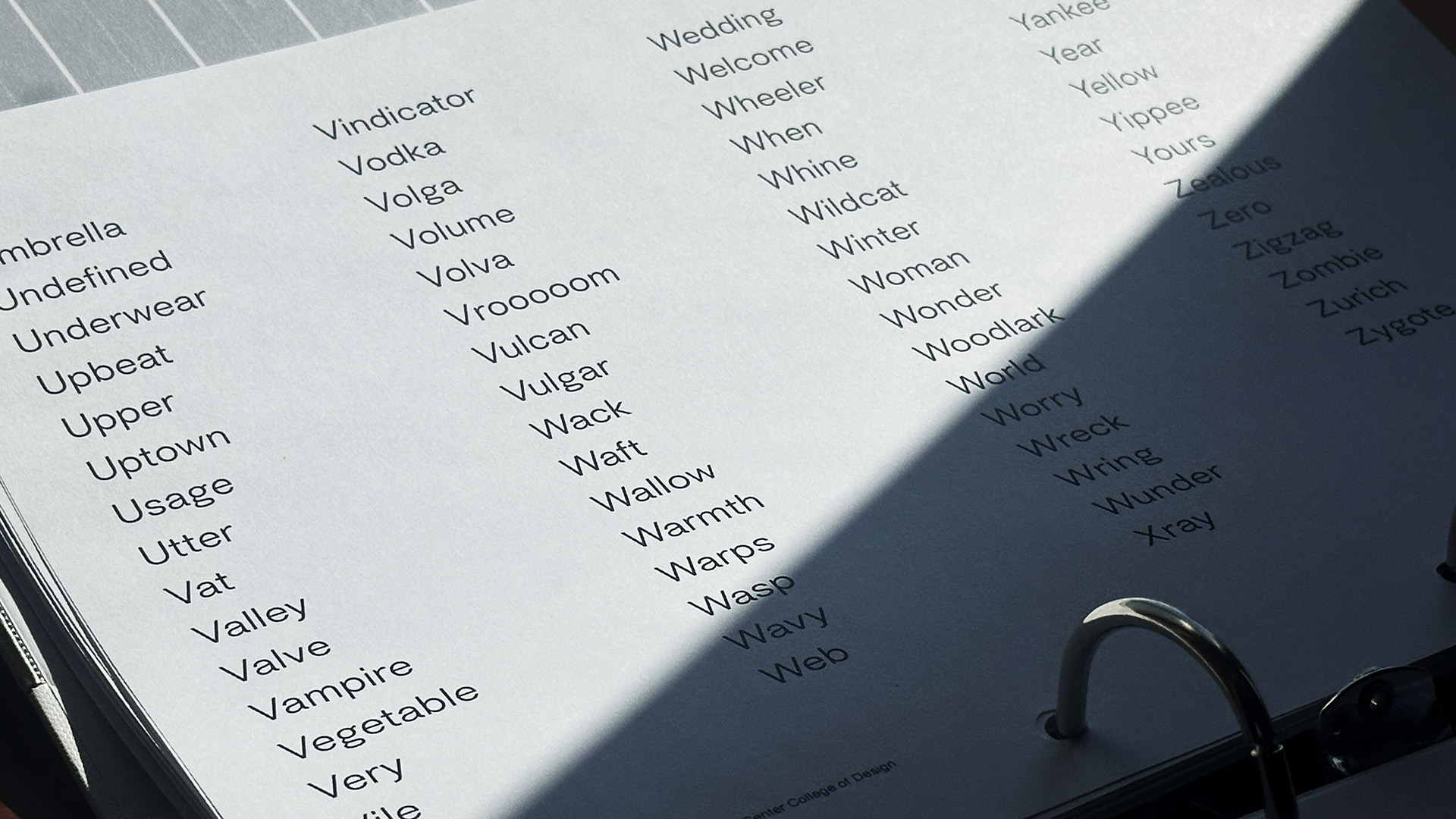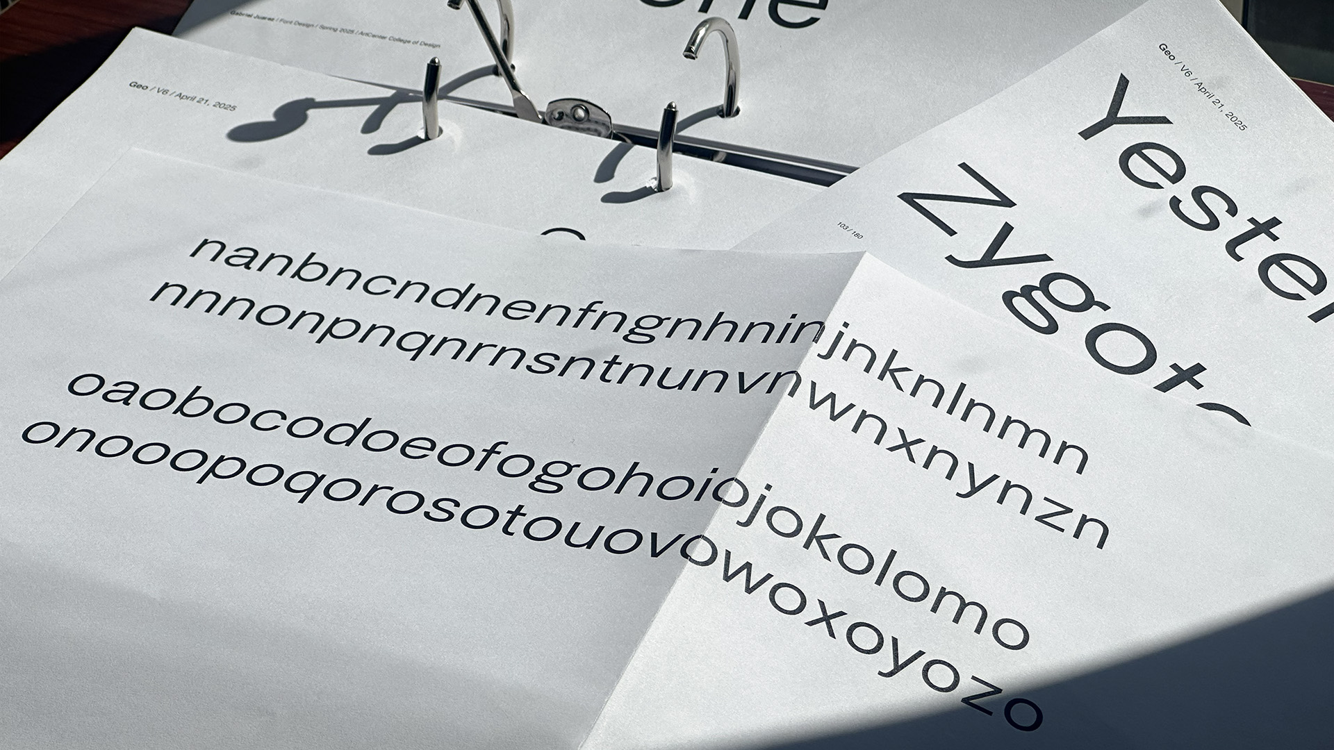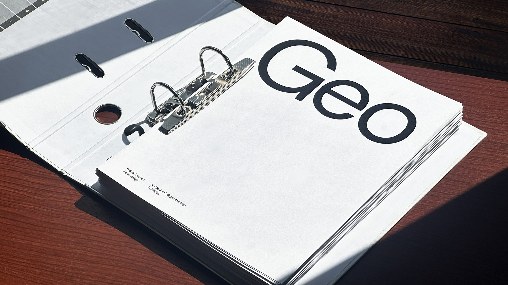
Geo is a sans-serif grotesque with a hint of geometric influence. I designed Geo to convey a voice that is reliable yet friendly. It is meant for applications which balance authenticity and approachability.
I use this font for this site as well!
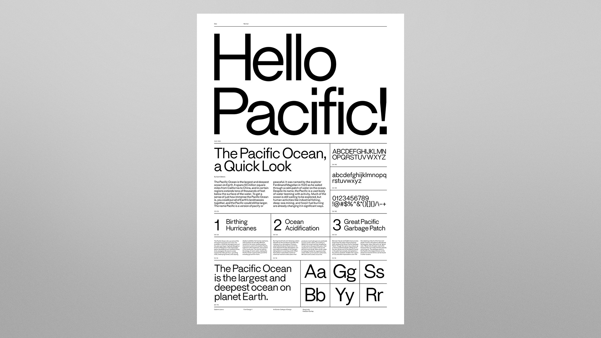
I designed Geo to bridge the authoritative voice of grotesques and the warmth and approachability of geometric fonts.
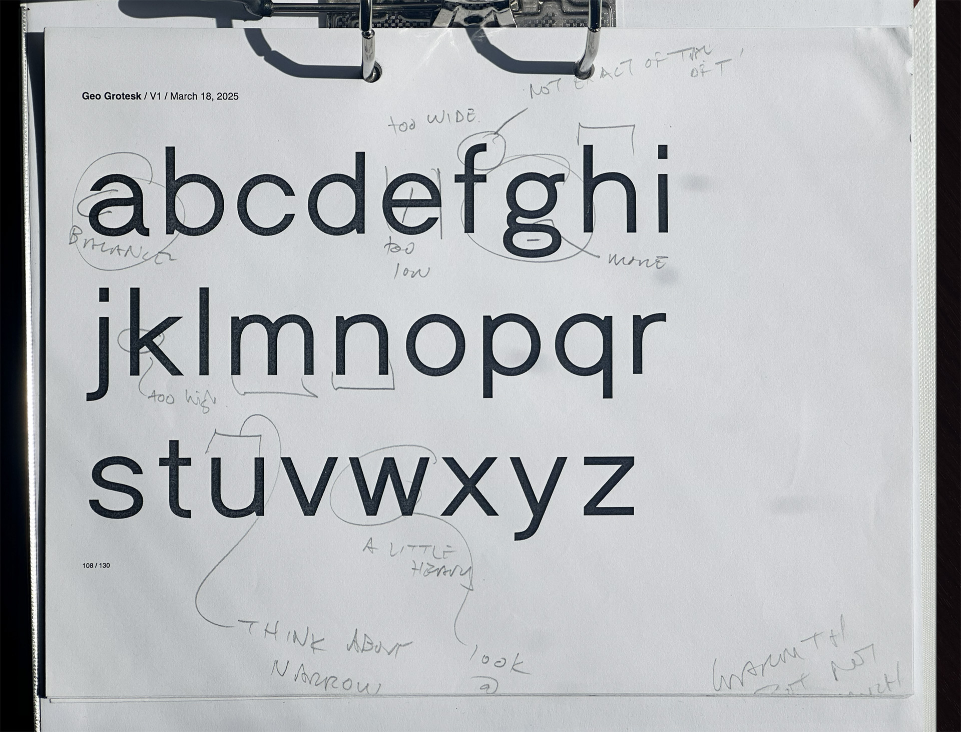
Compared to typical grotesques, Geo employs a low x-height and slightly more circular geometry. Geo uses a double-story 'a' and 'g' to aid legibility and contribute to its reliable voice.